Regression diagnostics
Contents
Regression diagnostics#
When we fit a linear regression model to a particular data set, many problems may occur. Most common among these are the following [James et al., 2021]:
Outliers and high-leverage points
Non-linearity of the response-predictor relationship
Non-constant variance of error terms (heteroscedasticity)
Non-normally distributed errors
Correlation of error terms
Collinearity
As an example of how to identify these problems, we use data about the prestige of canadian occupations to estimate a regression model with prestige as the response and income and education as predictors. Review this site to learn more about the data.
This tutorial is mainly based on the excellent statmodels documentation about regression plots.
Python setup#
import numpy as np
import pandas as pd
from patsy import dmatrices

from statsmodels.compat import lzip
import statsmodels.api as sm
from statsmodels.formula.api import ols
from statsmodels.stats.outliers_influence import variance_inflation_factor
from statsmodels.tools.tools import add_constant

import matplotlib.pyplot as plt
import seaborn as sns

%matplotlib inline
plt.rc("figure", figsize=(16, 8))
plt.rc("font", size=14)
Import data#
We use the function .datasets.get_rdataset to load the dataset from the Rdatasets package.
# import data
df = sm.datasets.get_rdataset("Duncan", "carData", cache=True).data
# show head of DataFrame
df.head()
| type | income | education | prestige | |
|---|---|---|---|---|
| accountant | prof | 62 | 86 | 82 |
| pilot | prof | 72 | 76 | 83 |
| architect | prof | 75 | 92 | 90 |
| author | prof | 55 | 90 | 76 |
| chemist | prof | 64 | 86 | 90 |
# plot numerical data as pairs
sns.pairplot(df);
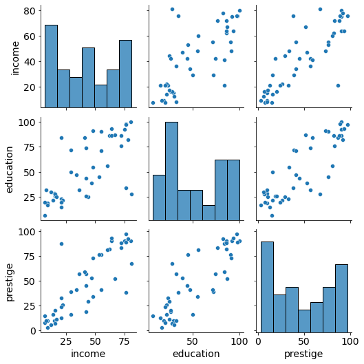
Findings:
Positive association between prestige and eduction as well as between prestige and income
Relationships seem to be linear in both cases.
Model#
# estimate the model and save it as lm (linear model)
lm = ols("prestige ~ income + education", data=df).fit()
# print regression results
print(lm.summary())
                            OLS Regression Results
==============================================================================
Dep. Variable:               prestige   R-squared:                       0.828
Model:                            OLS   Adj. R-squared:                  0.820
Method:                 Least Squares   F-statistic:                     101.2
Date:                Tue, 05 Apr 2022   Prob (F-statistic):           8.65e-17
Time:                        19:18:25   Log-Likelihood:                -178.98
No. Observations:                  45   AIC:                             364.0
Df Residuals:                      42   BIC:                             369.4
Df Model:                           2
Covariance Type:            nonrobust
==============================================================================
                 coef    std err          t      P>|t|      [0.025      0.975]
------------------------------------------------------------------------------
Intercept     -6.0647      4.272     -1.420      0.163     -14.686       2.556
income         0.5987      0.120      5.003      0.000       0.357       0.840
education      0.5458      0.098      5.555      0.000       0.348       0.744
==============================================================================
Omnibus:                        1.279   Durbin-Watson:                   1.458
Prob(Omnibus):                  0.528   Jarque-Bera (JB):                0.520
Skew:                           0.155   Prob(JB):                        0.771
Kurtosis:                       3.426   Cond. No.                         163.
==============================================================================

Notes:
[1] Standard Errors assume that the covariance matrix of the errors is correctly specified.
Regression diagnostics#
Outliers and high-leverage points#
In a regression analysis, single observations can have a strong influence on the results of the model.
For example, in the plot below we can see how a single outlying data point can affect a model.
# HIDE CODE
df_outlier = pd.DataFrame(
        { 'observation': pd.Categorical([ "A", "B", "C", "D", "E" ]),
          'x': np.array([1, 2, 3, 4, 5],dtype='int32'),
          'y': np.array([2, 4, 6, 8, 2],dtype='int32')}
        )

sns.lmplot(x="x", y="y", data=df_outlier, ci=False);
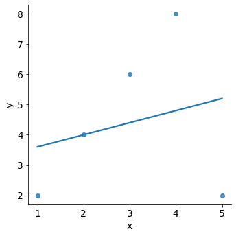
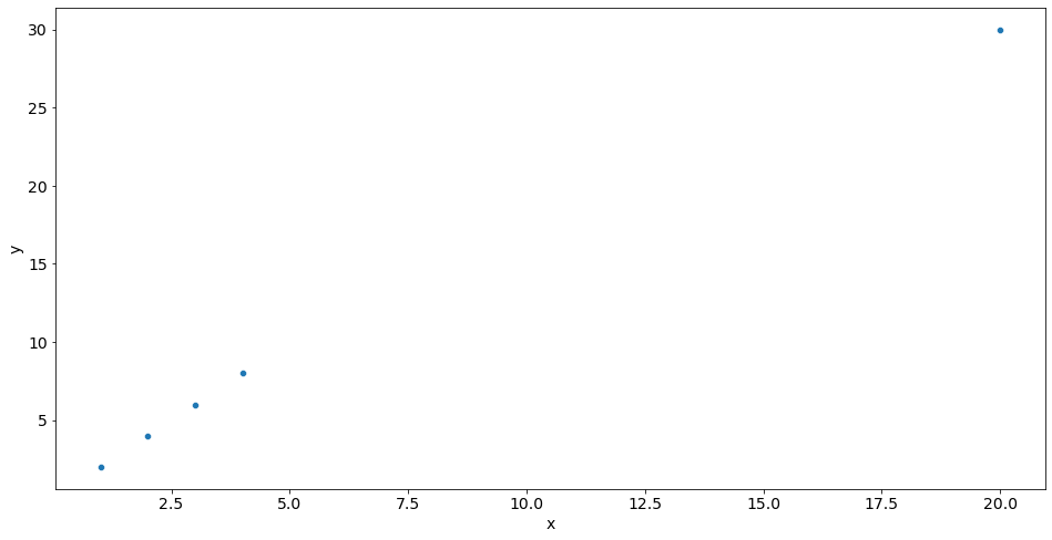
We can spot outliers by using graphs like the scatterplot above.
sns.scatterplot(x='x', y='y', data=df_outlier);
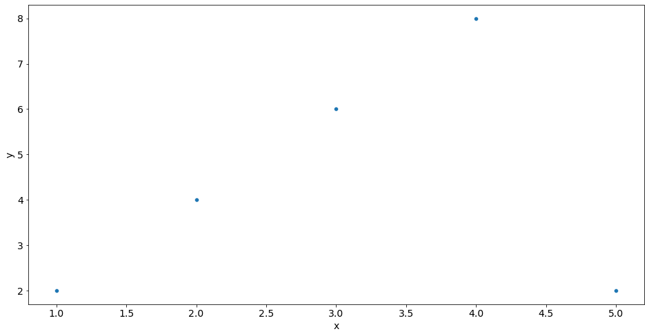
We just saw that outliers are observations for which the response \(y_i\) is unusual given the predictor \(x_i\).
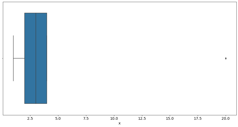
In contrast, observations with high leverage have an unusual value for \(x_i\).
# HIDE CODE
df_leverage = pd.DataFrame(
        { 'observation': pd.Categorical([ "A", "B", "C", "D", "E" ]),
          'x': np.array([1, 2, 3, 4, 20],dtype='int32'),
          'y': np.array([2, 4, 6, 8, 30],dtype='int32')}
        )

sns.lmplot(x="x", y="y", data=df_leverage, ci=False);
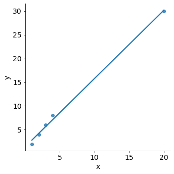
For example, the observation with a value of \(x=20\) has high leverage, in that the predictor value for this observation is large relative to the other observations. The removal of the high leverage observation would have a substantial impact on the regression line. In general, high leverage observations tend to have a sizable impact on the estimated regression line. Therefore, it is important to detect influential observations and to take them into consideration when interpreting the results.
Again, we could use simple graphs to identify unusual observations.
sns.scatterplot(x='x', y='y', data=df_leverage);
sns.boxplot(x='x', data=df_leverage);
Influence plots#
Influence plots are used to identify influential data points.
They depend on both the residual and leverage i.e they take into account both the \(x\) value and \(y\) value of the observation.
We can use influence plots to identify observations in our independent variables which have “unusual” values in comparison to other values.
Influence plots show the (externally) studentized residuals vs. the leverage of each observation:
Dividing a statistic by a sample standard deviation is called studentizing, in analogy with standardizing and normalizing. The basic idea is to:
Delete the observations one at a time.
Refit the regression model each time on the remaining n–1 observations.
Compare the observed response values to their fitted values based on the models with the ith observation deleted. This produces unstandardized deleted residuals.
Standardising the deleted residuals produces studentized deleted residuals (also known as externally studentized residuals)
In essence, externally studentized residuals are residuals that are scaled by their standard deviation. If an observation has an externally studentized residual that is larger than 3 (in absolute value) we can call it an outlier. However, values greater then 2 (in absolute values) are usually also of interest.
Leverage is a measure of how far away the independent variable values of an observation are from those of the other observations. High-leverage points are outliers with respect to the independent variables.
In statsmodels .influence_plot the influence of each point can be visualized by the criterion keyword argument. Options are Cook’s distance and DFFITS, two measures of influence. Steps to compute Cook’s distance:
Delete observations one at a time.
Refit the regression model on remaining (n−1) observations
Examine how much all of the fitted values change when the ith observation is deleted.
fig = sm.graphics.influence_plot(lm, criterion="cooks")
fig.tight_layout(pad=1.0)
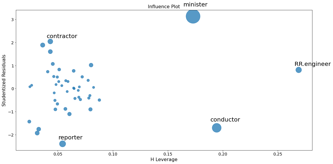
To identify values with high influence, we look for observations with:
big blue points (high Cook’s distance) and
high leverage (X-axis) which additionally have
high or low studentized residuals (Y-axis).
There are a few worrisome observations with big blue dots in the plot:
RR.engineerhas large leverage but small residual.Both
contractorandreporterhave low leverage but a large residual.Conductorandministerhave both high leverage and large residuals, and, therefore, large influence.
A general rule of thumb is that observations with a Cook’s distance over \(4/n\) (where n is the number of observations) are possible outliers with leverage.
In addition to our plot, we can use the function .get_influence() to assess the influence of each observation and compare them to the cricital Cook’s distance :
# obtain Cook's distance
lm_cooksd = lm.get_influence().cooks_distance[0]

# get length of df to obtain n
n = len(df["income"])

# calculate critical d
critical_d = 4/n
print('Critical Cooks distance:', critical_d)

# identification of potential outliers with leverage
out_d = lm_cooksd > critical_d

# output potential outliers with leverage
print(df.index[out_d], "\n",
    lm_cooksd[out_d])
Critical Cooks distance: 0.08888888888888889
Index(['minister', 'reporter', 'conductor'], dtype='object')
 [0.56637974 0.09898456 0.22364122]
Solutions#
If you have unusual observations in your data (unusual depends on your use case and domain knowledge) here some approaches to deal with them:
Drop the identified unusual observations.
Analyse your data with robust methods like bootstrapping (sampling with replacement).
Trim the data (delete a certain amount of scores from the extremes)
Windsorizing (substitute outliers with the highest value that isn’t an outlier)
Transform the data (by applying a mathematical function to scores - like a log transformation to reduce positive skew).
A note on data transformations:
Be aware that transforming the data helps as often as it hinders model performance (Games & Lucas, 1966). According to Games (1984):
Because of the central limit theorem, the sampling distribution will be normal in samples > 40 anyway.
Transforming the data changes the hypothesis being tested (e.g. when using a log transformation and comparing means you change from comparing arithmetic means to comparing geometric means)
In small samples it is tricky to determine normality one way or another.
The consequences for the statistical model of applying the “wrong” transformation could be worse than the consequences of analysing the untransformed scores.
Non-linearity and heteroscedasticity#
One crucial assumption of the linear regression model is the linear relationship between the response and the dependent variables. We can identify non-linear relationships in the regression model residuals if the residuals are not equally spread around the horizontal line (where the residuals are zero) but instead show a pattern, then this gives us an indication for a non-linear relationship.
Note
We can deal with non-linear relationships via basis expansions (e.g. polynomial regression) or regression splines (see Kuhn and Johnson [2019])
Another important assumption is that the error terms have a constant variance (homoscedasticity). For instance, the variances of the error terms may increase with the value of the response. One can identify non-constant variances in the errors, or heteroscedasticity, from the presence of a funnel shape in a residual plot.
When faced with this problem, one possible solution is to use weighted regression. This type of regression assigns a weight to each data point based on the variance of its fitted value. Essentially, this gives small weights to data points that have higher variances, which shrinks their squared residuals. When the proper weights are used, this can eliminate the problem of heteroscedasticity.
Partial Regression Plots#
Since we are doing multivariate regressions, we cannot just look at individual bivariate plots (e.g., prestige and income) to identify the type of relationships between response and predictor.
Instead, we want to look at the relationship of the dependent variable and independent variables conditional on the other independent variables. We can do this through using partial regression plots, otherwise known as added variable plots.
With partial regression plots you can:
Investigate the relationship between a dependent and independent variables conditional on other independent varibales.
Identify the effects of the individual data values on the estimation of a coefficient.
Investigate violations of underlying assumptions such as linearity and homoscedasticity.
If we want to identify the relationship between prestige and income, we would proceed as follows (we name the independent variable of interest \(X_k\) and all other independent variables \(X_{\sim k}\)):
Compute a regression model by regressing the response variable versus the independent variables excluding \(X_k\):
response variable:
prestige\(X_k\):
income\(X_{\sim k}\):
educationModel(\(X_{\sim k}\)):
(prestige ~ education)
Compute the residuals of Model(\(X_{\sim k}\)):
\(R_{X_{\sim k}}\): residuals of Model(\(X_{\sim k}\)):
Compute a new regression model by regressing \(R_{X_{\sim k}}\) on \(X_{\sim k}\).
Model(\(X_k\)): \(R_{X_{\sim k}}\) ~
income
Compute the residuals of Model(\(X_k\)):
\(R_{X_{k}}\): residuals of Model(\(X_{k}\)):
Make a partial regression plot by plotting the residuals from \(R_{X_{\sim k}}\) against the residuals from \(R_{X_{k}}\):
Plot with X = \(R_{X_{k}}\) and Y = \(R_{X_{\sim k}}\)
For a quick check of all the regressors, you can use plot_partregress_grid. These plots will not label the
points, but you can use them to identify problems and then use plot_partregress to get more information.
fig = sm.graphics.plot_partregress_grid(lm)
fig.tight_layout(pad=1.0)
eval_env: 1
eval_env: 1
eval_env: 1
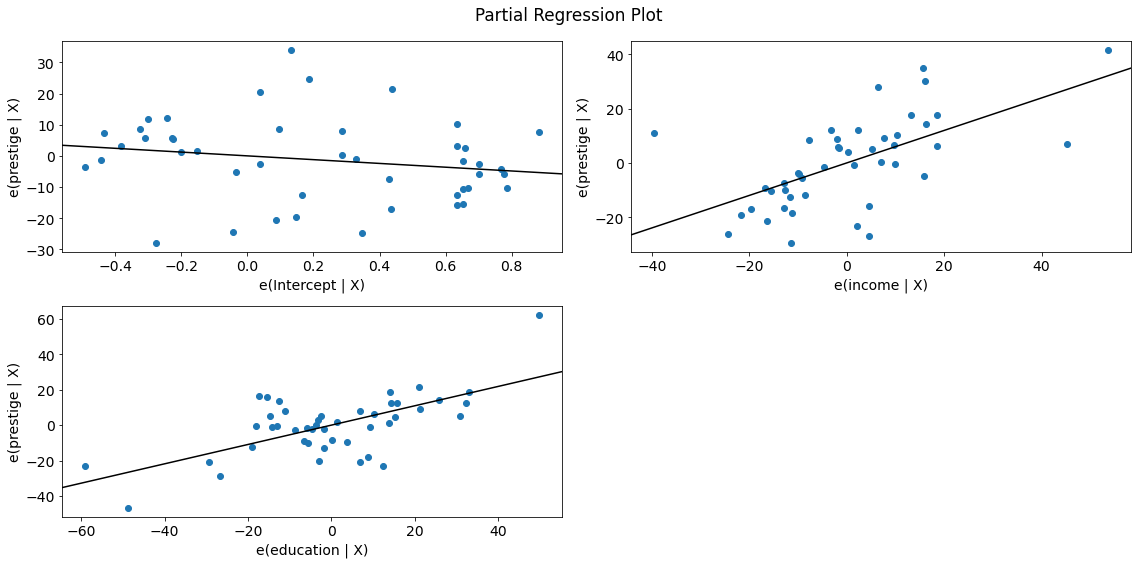
We observe a positive relationship between prestige and income as well as between prestige and education. The relationship seems to be linear in both cases.
Next, let’s take a closer look at the observations.
sm.graphics.plot_partregress(
                             endog='prestige', # response
                             exog_i='income', # variable of interest
                             exog_others=['education'], # other predictors
                             data=df,  # dataframe
                             obs_labels=True # show labels
                             );
eval_env: 1

# same plot for education
fig = sm.graphics.plot_partregress("prestige", "education", ["income"], data=df)
fig.tight_layout(pad=1.0)
eval_env: 1
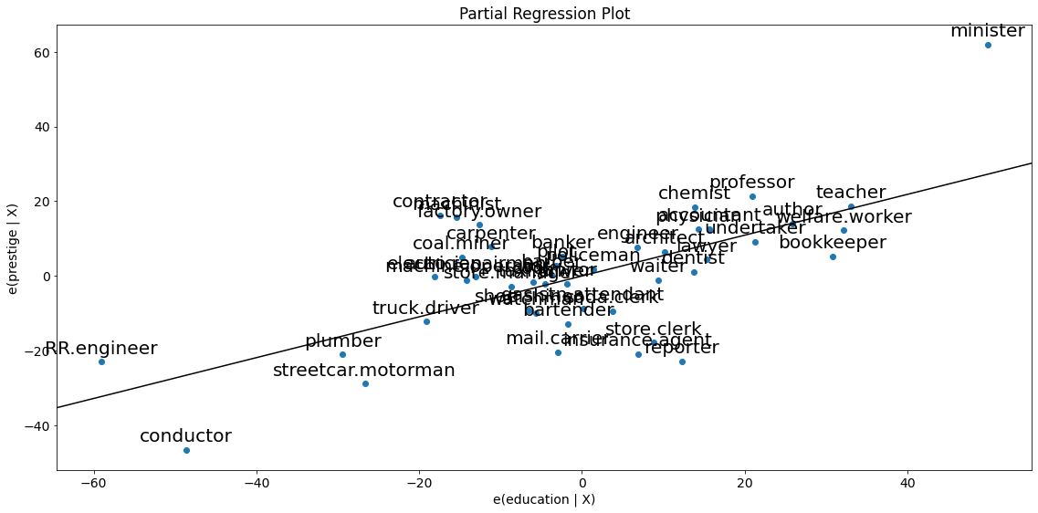
The partial regression plots confirm the influence of conductor, minister on the partial relationships between prestige and the predictors income and education. The influence of reporter is less obvious but since the observation was considered critical according to Cook`s D, we also drop this case.
Note that influential cases potentially bias the effect of income and education on prestige. Therefore, we will drop these cases and perform a linear regression without them.
# make a subset and flag as TRUE if index doesn't contain ...
subset = ~df.index.isin(["conductor", "minister", "reporter"])

print(df.index, "\n", subset)
Index(['accountant', 'pilot', 'architect', 'author', 'chemist', 'minister',
       'professor', 'dentist', 'reporter', 'engineer', 'undertaker', 'lawyer',
       'physician', 'welfare.worker', 'teacher', 'conductor', 'contractor',
       'factory.owner', 'store.manager', 'banker', 'bookkeeper',
       'mail.carrier', 'insurance.agent', 'store.clerk', 'carpenter',
       'electrician', 'RR.engineer', 'machinist', 'auto.repairman', 'plumber',
       'gas.stn.attendant', 'coal.miner', 'streetcar.motorman', 'taxi.driver',
       'truck.driver', 'machine.operator', 'barber', 'bartender',
       'shoe.shiner', 'cook', 'soda.clerk', 'watchman', 'janitor', 'policeman',
       'waiter'],
      dtype='object')
 [ True  True  True  True  True False  True  True False  True  True  True
  True  True  True False  True  True  True  True  True  True  True  True
  True  True  True  True  True  True  True  True  True  True  True  True
  True  True  True  True  True  True  True  True  True]
# compute regression without influential cases
lm2 = ols("prestige ~ income + education", data=df, subset=subset).fit()

print(lm2.summary())
                            OLS Regression Results
==============================================================================
Dep. Variable:               prestige   R-squared:                       0.897
Model:                            OLS   Adj. R-squared:                  0.891
Method:                 Least Squares   F-statistic:                     169.0
Date:                Tue, 05 Apr 2022   Prob (F-statistic):           6.13e-20
Time:                        19:18:31   Log-Likelihood:                -157.02
No. Observations:                  42   AIC:                             320.0
Df Residuals:                      39   BIC:                             325.2
Df Model:                           2
Covariance Type:            nonrobust
==============================================================================
                 coef    std err          t      P>|t|      [0.025      0.975]
------------------------------------------------------------------------------
Intercept     -7.2414      3.391     -2.136      0.039     -14.099      -0.383
income         0.8773      0.113      7.775      0.000       0.649       1.106
education      0.3538      0.092      3.861      0.000       0.168       0.539
==============================================================================
Omnibus:                        1.483   Durbin-Watson:                   1.577
Prob(Omnibus):                  0.476   Jarque-Bera (JB):                0.744
Skew:                          -0.291   Prob(JB):                        0.689
Kurtosis:                       3.293   Cond. No.                         156.
==============================================================================

Notes:
[1] Standard Errors assume that the covariance matrix of the errors is correctly specified.
Dropping the influential cases confirms our believe. The new regression model without the influential cases is superior to the initial one. To see this, compare the regression summary above with our initial summary (e.g., see \(R^2\), adjusted \(R^2\) and the F-statistic).
CCPR plots#
The Component-Component plus Residual (CCPR) plot provides another way to judge the effect of one regressor on the response variable by taking into account the effects of the other independent variables. They are also a good way to see if the predictors have a linear relationship with the dependent variable.
A CCPR plot consists of a partial residuals plot and a component:
The partial residuals plot is defined as \(\text{Residuals} + \hat\beta_{i} X_i \text{ }\text{ }\) versus \(X_i\), where
Residuals = residuals from the full model
\(\hat\beta_{i}\) = regression coefficient from the ith independent variable in the full model
\(X_i\) = the ith independent variable
The component adds \(\hat\beta_{i}\) \(X_i\) versus \(X_i\) to show where the fitted line would lie.
A significant difference between the residual line and the actual distribution of values indicates that the predictor does not have a linear relationship with the dependent variable.
Care should be taken if \(X_i\) is highly correlated with any of the other independent variables (see multicollinearity). If this is the case, the variance evident in the plot will be an underestimate of the true variance.
fig = sm.graphics.plot_ccpr(lm, "education")
fig.tight_layout(pad=1.0)
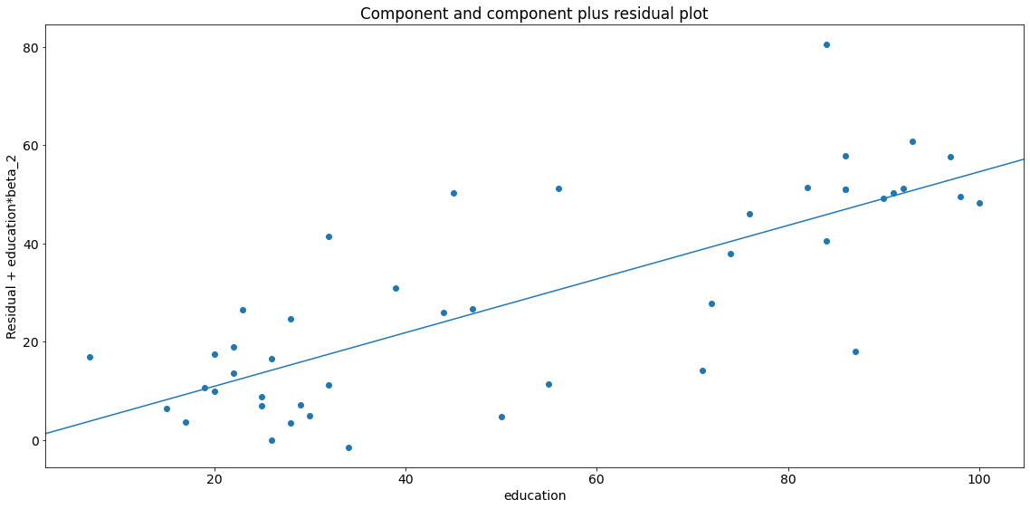
As you can see the relationship between the variation in \(y\) explained by education conditional on income seems to be linear, though you can see there are some observations that are exerting considerable influence on the relationship (see section leverage).
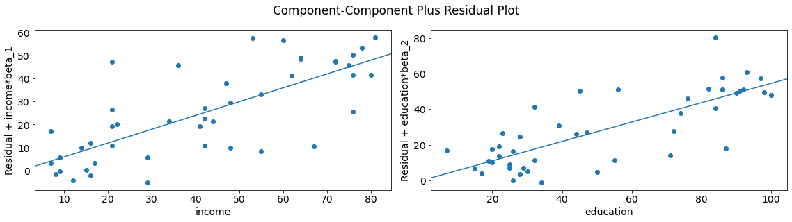
We can quickly look at more than one variable by using plot_ccpr_grid.
fig = sm.graphics.plot_ccpr_grid(lm)
fig.tight_layout(pad=1.0)
Residuals vs fitted plot#
Residual plots are a useful graphical tool for identifying non-linearity as well as heteroscedasticity. The residuals of this plot are those of the regression fit with all predictors.
You can use seaborn’s residplot to investigate possible violations of underlying assumptions such as linearity and homoskedasticity.
# fitted values
model_fitted_y = lm.fittedvalues

#  Plot
plot = sns.residplot(x=model_fitted_y, y='prestige', data=df, lowess=True,
                     scatter_kws={'alpha': 0.5},
                     line_kws={'color': 'red', 'lw': 1, 'alpha': 0.8})

# Titel and labels
plot.set_title('Residuals vs Fitted')
plot.set_xlabel('Fitted values')
plot.set_ylabel('Residuals');
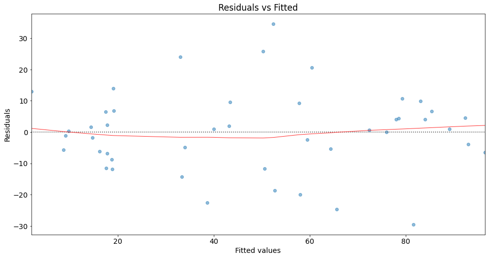
This plot shows how residuals are spread along the ranges of predictors. It’s a good sign if we observe relatively equal (randomly) spreaded points along the dotted horizontal line where the residuals are zero.
The red line indicates the fit of a locally weighted scatterplot smoothing (lowess), a local regression method, to the residual scatterplot. Local regression is a different approach for fitting flexible non-linear functions, which involves computing the fit at a target point \(x_0\) using only the nearby training observations {see cite:t}James2021 for more details).
Note
lowess creates a smooth line through the scatter plot to help us investigate the relationship between the fitted values and the residuals.
We can interpret the result of our lowess fit as follows: The fit is almost equal to the dotted horizontal line where the residuals are zero. This is an indication for a linear relationship. Note that in the case of non-linear relationships, we typically observe a pattern which deviates strongly from a horizontal line.
Regarding homoscedasticity, the residuals seem to spread equally wide with an increase of x. This is an indication of homoscedasticiy. Next, we use the Breusch-Pagan Lagrange Multiplier test to confirm our assumption.
Breusch-Pagan Lagrange Multiplier test#
The Breusch-Pagan Lagrange Multiplier test can be used to identify heteroscedasticity.
The test assumes homoscedasticity (this is the null hypothesis \(H_0\)) which means that the residual variance does not depend on the values of the variables in x.
Note that this test may exaggerate the significance of results in small or moderately large samples [Greene, 2000]. In this case the F-statistic is preferable.
If one of the test statistics is significant (i.e., p <= 0.05), then you have indication of heteroscedasticity.
name = ['Lagrange multiplier statistic', 'p-value', 'f-value', 'f p-value']
test = sm.stats.het_breuschpagan(lm.resid, lm.model.exog)
lzip(name, test)
[('Lagrange multiplier statistic', 0.5752191351127306),
 ('p-value', 0.7500543806429694),
 ('f-value', 0.27191134322318933),
 ('f p-value', 0.7632527707017838)]
In our case, both p-values are above 0.05, which means we can accept the null hypothesis. Therefore, we have an indication of homoscedasticity.
Single Variable Regression Diagnostics#
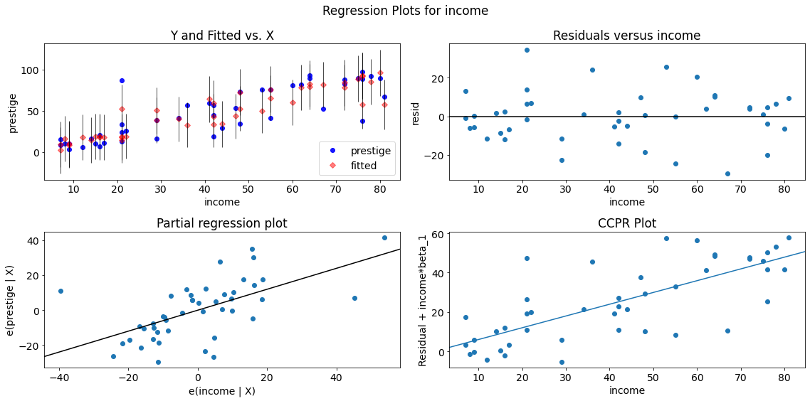
The plot_regress_exog function is a convenience function which can be used for quickly checking modeling assumptions with respect to a single regressor.
It gives a 2x2 plot containing the:
dependent variable and fitted values with prediction confidence intervals vs. the independent variable chosen,
the residuals of the model vs. the chosen independent variable,
a partial regression plot, and a
CCPR plot.
fig = sm.graphics.plot_regress_exog(lm, "income")
fig.tight_layout(pad=1.0)
eval_env: 1
Solutions#
If we are faced with non-linear relationships between the dependent and independent variables, we can adjust the linear model via different methods (for more details, see Kuhn and Johnson [2019]):
Basis expansions (polynomial features)
Regression splines (especially natural cubic splines)
Locally weighted scatterplot smoothing (loess)
Generalized additive models (GAMs)
In particular, GAMs extend general linear models to have nonlinear terms for individual predictors. GAM models can adaptively model separate basis functions for different variables and estimate the complexity for each. In other words, different predictors can be modeled with different levels of complexity [Kuhn and Johnson, 2019].
In case of heteroscedasticity, you have the following options to get realsitic estimates of the standard errors:
Use heteroskedasticity-consistent standard error estimators for OLS regression (see statsmodels
Use weight least squares (see statsmodels)
Non-normally distributed errors#
It can be helpful if the residuals in the model are random, normally distributed variables with a mean of 0. This assumption means that the differences between the predicted and observed data are most frequently zero or very close to zero, and that differences much greater than zero happen only occasionally.
Note that non-normally distributed errors are not problematic for our model parameters but they may effect significance tests and confidence intervals.
Jarque-Bera test#
The Jarque–Bera (JB) test is a goodness-of-fit test of whether sample data have the skewness and kurtosis matching a normal distribution.
The null hypothesis (\(H_0\)) is a joint hypothesis of:
the skewness being zero and
the kurtosis being 3.
Samples from a normal distribution have an:
expected skewness of 0 and
an expected excess kurtosis of 0 (which is the same as a kurtosis of 3).
Any deviation from this assumptions increases the JB statistic.
Next, we calculate the statistics but you can also find the results of the Jarque-Bera test in the regression summary.
name = ['Jarque-Bera', 'Chi^2 two-tail prob.', 'Skew', 'Kurtosis']
test = sm.stats.jarque_bera(lm.resid)

lzip(name, test)
[('Jarque-Bera', 0.5195278349686433),
 ('Chi^2 two-tail prob.', 0.7712336390906139),
 ('Skew', 0.1549318677987544),
 ('Kurtosis', 3.425518480614924)]
The p-value is above 0.05 and we can accept \(H_0\). Therefore, the test gives us an indication that the errors are normally distributed.
Omnibus normtest#
Another test for normal distribution of residuals is the Omnibus normtest (also included in the regression summary). The test allows us to check whether or not the model residuals follow an approximately normal distribution.
Our null hypothesis (\(H_0\)) is that the residuals are from a normal distribution.
name = ['Chi^2', 'Two-tail probability']
test = sm.stats.omni_normtest(lm.resid)
lzip(name, test)
[('Chi^2', 1.2788071145675917), ('Two-tail probability', 0.5276070175778638)]
The p-value is above 0.05 and we can accept \(H_0\). Therefore, the test gives us an indication that the errors are from a normal distribution.
Solution#
Note that the assumption of normality can be (at least partly) relaxed if the sample size N is large enough; the errors need not follow a normal distribution because of the Central Limit Theorem (CLT). In other words, the assumption of normality is in most of the cases not crucial with large enough N (usually if N ≥ 50).
Correlation of error terms#
Another important assumption of the linear regression model is that the error terms are uncorrelated. If they are not, then p-values associated with the model will be lower than they should be and confidence intervalls are not reliable [James et al., 2021].
Correlated errors occur especially in the context of time series data. In order to determine if this is the case for a given data set, we can plot the residuals from our model as a function of time. If the errors are uncorrelated, then there should be no evident pattern. This means if the errors are uncorrelated, then the fact that \(ϵ_i\) is positive provides little or no information about the sign of \(ϵ_{i+1}\).
Correlation among the error terms can also occur outside of time series data. For instance, consider a study in which individuals’ heights are predicted from their weights. The assumption of uncorrelated errors could be violated if some of the individuals in the study are members of the same family, or eat the same diet, or have been exposed to the same environmental factors [Field, 2013].
Durbin-Watson test#
A test of autocorrelation that is designed to take account of the regression model is the Durbin-Watson test (also included in the regression summary). It is used to test the hypothesis that there is no lag one autocorrelation in the residuals. This means if there is no lag one autocorrelation, then information about \(ϵ_i\) provides little or no information about \(ϵ_{i+1}\).
If there is no autocorrelation, the test-statistic is around 2.
This statistic will always be between 0 and 4.
The closer to 0 the statistic, the more evidence for positive serial correlation.
The closer to 4, the more evidence for negative serial correlation.
As a rough rule of thumb [Field, 2013]:
If Durbin–Watson is less than 1.0, there may be cause for concern.
Small values of d indicate successive error terms are positively correlated.
If d > 2, successive error terms are negatively correlated.
sm.stats.durbin_watson(lm.resid)
1.458332862235202
Solution#
We can get consistent estimates of the standard errors with Newey-West standard errors. See statsmodels documentation for implementation details.
Furthermore, you can use a generalized least squares (GLS) model instead of the ordinary least squares (OLS).
In the case of correlated errors, you may also use a multilevel model (also known as hierarchical linear models, linear mixed-effect model, mixed models, nested data models, random coefficient, random-effects models, random parameter models, or split-plot designs).
Multilevel models are particularly appropriate for research designs where data for participants are organized at more than one level (i.e., nested data). The units of analysis are usually individuals (at a lower level) who are nested within contextual/aggregate units (at a higher level).
See statsmodels’ documentation to learn how to implement multilevel models.
Collinearity#
Collinearity refers to the situation in which two or more predictor variables collinearity are closely related to one another. The presence of collinearity can pose problems in the regression context, since it can be difficult to separate out the individual effects of collinear variables on the response.
It is possible for collinearity to exist between three or more variables even if no pair of variables has a particularly high correlation. We call this situation multicollinearity.
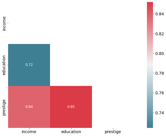
Correlation matrix#
A simple way to detect collinearity is to look at the correlation matrix of the predictors. An element of this matrix that is large in absolute value indicates a pair of highly correlated variables, and therefore a collinearity problem in the data.
Unfortunately, not all collinearity problems can be detected by inspection of the correlation matrix since it is possible for collinearity to exist between three or more variables even if no pair of variables has a particularly high correlation.
# Inspect correlation
# Calculate correlation using the default method ( "pearson")
corr = df.corr()
# optimize aesthetics: generate mask for removing duplicate / unnecessary info
mask = np.zeros_like(corr, dtype=bool)
mask[np.triu_indices_from(mask)] = True
# Generate a custom diverging colormap as indicator for correlations:
cmap = sns.diverging_palette(220, 10, as_cmap=True)
# Plot
sns.heatmap(corr, mask=mask, cmap=cmap, annot=True,  square=True, annot_kws={"size": 12});
Variance inflation factor (VIF)#
Instead of inspecting the correlation matrix, a better way to assess multicollinearity is to compute the variance inflation factor (VIF). Note that we ignore the intercept in this test.
The smallest possible value for VIF is 1, which indicates the complete absence of collinearity.
Typically in practice there is a small amount of collinearity among the predictors.
As a rule of thumb, a VIF value that exceeds 5 indicates a problematic amount of collinearity and the parameter estimates will have large standard errors because of this.
Note that the function variance_inflation_factor expects the presence of a constant in the matrix of explanatory variables. Therefore, we use add_constant from statsmodels to add the required constant to the dataframe before passing its values to the function.
# choose features and add constant
features = add_constant(df[['income', 'education']])
# create empty DataFrame
vif = pd.DataFrame()
# calculate vif
vif["VIF Factor"] = [variance_inflation_factor(features.values, i) for i in range(features.shape[1])]
# add feature names
vif["Feature"] = features.columns

vif.round(2)
| VIF Factor | Feature | |
|---|---|---|
| 0 | 4.59 | const |
| 1 | 2.10 | income |
| 2 | 2.10 | education |
We don’t have a problematic amount of collinearity in our data.
Solution#
A simple solution would be to remove some of the highly correlated features. Furthermore, you could manually combine some features (e.g. adding them together) or use a method which automatically combines features, such as principal components analysis or partial least squares regression.